
Creating Effective Affiliate Landing Pages

LinkHaitao | 2025-10-09

Photo credit: AdsTerra
A great affiliate landing page can make or break your campaign. It’s not just where your traffic lands — it’s where decisions are made. For advertisers, the goal is clear: turn interest into action. Whether you’re recruiting affiliates, showcasing an offer, or nurturing leads, your landing page is often the first (and only) impression that determines if your visitor stays or bounces.
Let’s break down what makes a landing page work — and look at real-world inspiration from top affiliate programs.
What Makes a Good Affiliate Landing Page?
At its core, an affiliate landing page has one job: guide visitors toward a single, focused action. Unlike your homepage, it’s not about everything you offer — it’s about this one opportunity.
According to HubSpot, the best landing pages eliminate distractions and present a clear value proposition paired with a strong call-to-action (CTA). In other words, make it obvious what you want the user to do — whether that’s signing up, applying, or buying.
But clarity isn’t the only factor. The best pages also connect emotionally, build trust, and remove friction. That means using benefit-driven headlines, short and persuasive copy, social proof (like testimonials or logos), and a design that looks credible at first glance.
Speak to the “Why,” Not Just the “What”
One of the most common mistakes advertisers make is leading with features rather than benefits. Affiliates don’t just want to know what your program pays — they want to know why it’s worth their time.
Instead of writing,
“Earn 10% commission per sale,”
try,
“Earn up to 10% per sale promoting high-demand products your audience already loves.”
That shift speaks to motivation, not mechanics. As Linear Design notes, affiliate landing pages convert better when they frame every element — from the headline to the button — around the user’s intent and reward.
Build Trust Early
Affiliate partners are cautious — and rightly so. Before signing up, they want to know your program is legitimate, transparent, and supportive. That’s why the most successful recruitment pages, like those highlighted by Partnerize, immediately answer key trust questions:
●What makes your program different?
●What support or tools do affiliates get?
●How and when are commissions paid?
You don’t need long paragraphs to cover these points — just a clean layout with concise, honest answers. Many programs also feature short testimonials from current affiliates or recognizable brand partners, which helps new applicants feel more confident.
Make Your CTA Count
Every landing page needs a clear, visible, and consistent call-to-action. “Join Now,” “Apply Today,” or “Start Earning” — whatever your phrase, it should feel action-oriented and reward-driven.
According to RichAds, repeating your CTA throughout the page (especially near the top and bottom) boosts conversions significantly. Visitors who scroll through your content should never have to hunt for the next step — it should be right there, ready to click.
Keep It Clean — and Fast
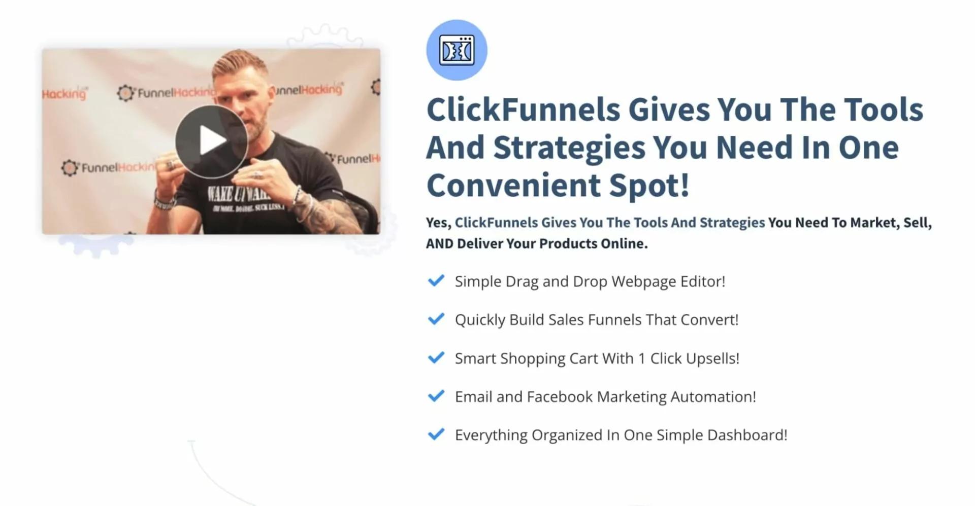
Photo credit: AdsTerra
Design simplicity goes a long way. Avoid clutter, keep your color palette consistent with your brand, and make sure there’s plenty of breathing room. White space isn’t wasted space; it helps your key message stand out.
Also, don’t overlook performance. WordStream notes that a one-second delay in load time can reduce conversions by up to 7%. For affiliate programs targeting global traffic — like those in LinkHaitao’s network — optimizing for mobile and fast-loading images is essential.
Add Social Proof and Transparency
No matter how sleek your design, visitors still look for reassurance. Add trust elements that validate your program — things like:
●Affiliate testimonials or success stories
●Recognizable partner logos
●Clear terms on commissions, cookie duration, and payouts
Programs that clearly display commission structures and payment details tend to attract more serious, long-term affiliates. Transparency doesn’t just build trust — it sets expectations and reduces drop-offs later.
Real-World Inspiration
Some of the best affiliate landing pages follow a simple formula: benefit upfront, clarity throughout, and proof at the end.
Take the Impact affiliate signup page — it opens with a strong headline about helping partners “grow their revenue,” uses short sections to explain value, and closes with an inviting CTA. Partnerize does something similar, showcasing its partner ecosystem and making the next step unmistakable.
Meanwhile, RichAds highlights examples from affiliate programs like V.Partners, which use bold colors, motivational headlines, and immediate CTAs like “Start Earning Now” to drive quick action.
The takeaway? Your landing page doesn’t need to be fancy. It just needs to be focused, persuasive, and friction-free.
Continuous Optimization Matters
Even the best-designed page can improve. Test different headlines, button colors, or layouts to see what resonates most with your audience. A/B testing isn’t just for advertisers — affiliate managers can use it to find the sweet spot between clarity and conversion.
Keep an eye on your analytics: look at bounce rates, time on page, and conversion percentages. Every insight helps you refine the experience — and every small improvement compounds over time.
Final Thoughts
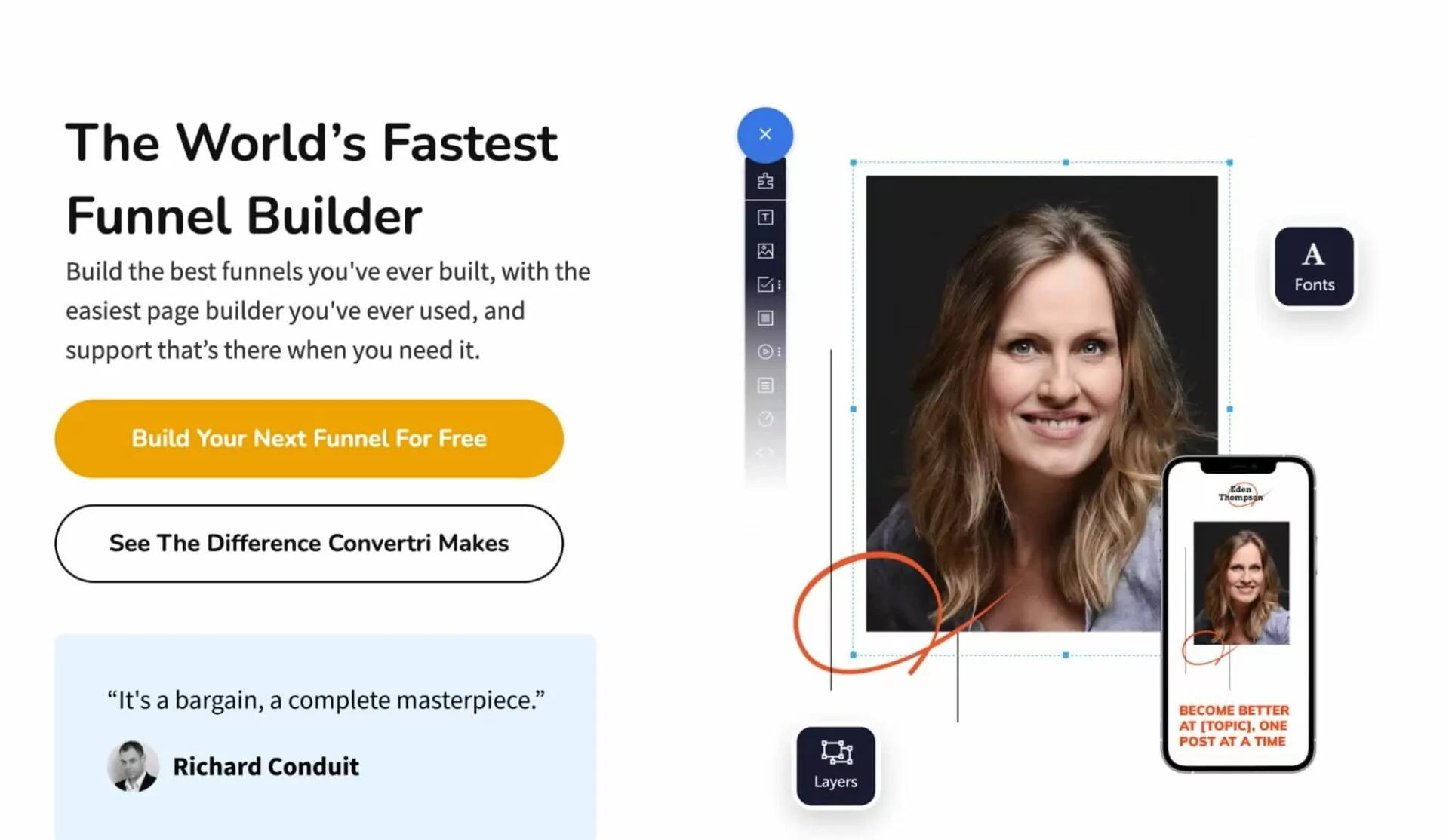
Photo credit: AdsTerra
An effective affiliate landing page doesn’t just attract clicks — it converts curiosity into commitment. By keeping your message focused, your design clean, and your offer transparent, you set the stage for stronger partnerships and higher ROI.
For advertisers in the LinkHaitao network, this isn’t just a design exercise — it’s a strategic advantage. A few thoughtful adjustments today can mean hundreds of qualified affiliates tomorrow.


